As an aside to the essay in my last post, I’ve been thinking a lot about the influence of Lichtenstein and his copyists on the development of mainstream comics. This is going to be long, because I really really like comics and I want to really illustrate my points. All pictures are from Wikimedia Commons unless otherwise stated.
We all associate Pop Art with the huge “fine art” versions of early fifties comics and this image of comic books has influenced people’s ideas of what comic book illustration is, how it’s made and printed, and its style. But as an avid reader of comic books myself I couldn’t help but notice that Lichtenstein’s “comic” pieces are far removed from the sequential art that’s cluttering up my bedroom. Does Lichtenstein loom so large in the popular consciousness that we ignore modern developments in comics? I don’t know. But here are some thoughts on the subject.
Lichtenstein produced most of his comic-inspired pieces in the late 1950s to mid 1960s, but their influence in his work (through his use of Ben-Day dot shading, contemporary printer’s colour pallets and fragments of comic-inspired faces (in his abstract pieces and “reflections” series)) continues until his death in 1997. This makes the majority of them contemporary with what in comics chronology is called the Silver Age, with the rest being contemporary with the Bronze and Modern Ages. However, Lichtenstein’s limited colour pallet, fairly flat shading and lightly stylised figures had more in common with the art of comics from the Golden Age of American Comics in the 1930s to 1950s. If you follow those links through and compare the art from the covers on the Wikipedia pages there, you’ll notice that the Silver Age sees the start of a wider and brighter colour pallet and heavier shading than earlier comics, there’s a lot more dark shadows, a lot more green and bright oranges and reds compared with the dark blues, pale greens and bright yellows of the Golden Age, when the inks used were far more limited.
Thematically, Lichtenstein’s work focuses mainly on two comic-book genres which were, interestingly, already in decline by the time he was working: Romance and War. War comics were very popular during the World Wars when they were produced as exciting, diverting propaganda. However, by the sixties they were losing steam. With the advent of the Vietnam War, such gung-ho attitudes were unpopular and seemed out of step, and the few war comics that survived changed their tone to a more melancholic one. By the late 1970s, there were hardly any still in print. Equally, romance comics were very popular in the fifties as a feminine alternative to superheroes, crime thrillers and war stories. A mixture of preachy morality tales (like the sensationalist I Joined a Teen-Aged Sex Club!), romantic fantasy and pin-up style “Good Girl Art” (art depicting sexy, curvaceous women and drawn well, nothing to do with the characters’ morality!), this was female fantasy filtered through a decidedly male mind. Romance comics were increasingly out-of-step with the savvy, liberated women of the 1960s and most had disappeared by the 1970s, surviving only as photo-comics in girls’ magazines. They only reappeared, in modest numbers, in the 1990s, when the notorious Comics Code relaxed it’s rules a little, allowing for more realistic (and sexual) relationships to be shown. Today, romance comics are mostly imported from Japan in the form of shojo manga. For another indication of the influence of Golden Age comics on Lichtenstein’s style, have a look at these covers depicting Good Girl Art from the late 1940s. Notice how the shape of the face, the treatment of the hair and the flat colouring on the face is very similar to Lichtenstein’s work. Now, some of Lichtenstein’s paintings were directly inspired by contemporary comics. His famous diptych Whaam! (1963) was an almost direct copy of a panel from DC Comics’ All American Men of War from 1962, but here the subject of the piece is decidedly old-fashioned: I’m reliably informed by my dad who knows far more about these things than I do that the type of fighter plane shown in the panel was all but obsolete by 1960.
So, Lichtenstein’s style and subject matter was already retro by the time of his work, so I think it’s safe to assume this was a deliberate commentary on the depictions of life in the comics of his youth. Notice too that the subject matter is fairly child-friendly: coy romances and boys-own war stories, but not other then-retro genres like, say, horror comics, which were in hiatus in the 50s and 60s thanks to the restrictions of the Comics Code. Both the war scenes and the romances Lichtenstein presents us with are highly sanitised: a pilot’s death in an explosion is hinted at through brightly coloured stars and cheerful lettering, or a girl’s trauma is reduced to a stoic tear. So, is Lichtenstein presenting us with a commentary on contemporary comic books? No. He’s highlighting the differences between the media’s depiction of life and the reality, much like Richard Hamilton’s collages.
But what makes this all the more interesting to me is how Lichtenstein’s already “retro” versions of comic book art have become the definitive version of comic book art in the popular consciousness. Lichtenstein inspired home décor and fashion accessories are fairly common sights in the shops these days, all sold under the label “comic” and not “pop art” which would be more specific and accurate.
What’s even more interesting is that the art in the comic books of the decades following Lichtenstein’s comic book “period” has become increasingly sophisticated.
Since Pop Art was about contemporary mass consumer culture, I’ll ignore underground commix in this analysis and just look at mainstream publishers in the West. In the 1970s, when Lichtenstein was still producing the odd comic-inspired piece, comic artists began to lean towards more heavy detail. For example, have a look at this 1977 cover from British comic 2000AD, featuring its flagship character, Judge Dredd. Notice how the detail in the background is separated from Dredd himself with a different style of inking (the inking on Dredd’s costume is far heavier than anything behind him, making him pop out as our central focus despite the busy composition). Notice too there is a lot more detail in both the background and in Dredd’s rather elaborate armour than in the Golden Age work we were looking at earlier. But there’s still plenty of text here, with big speech bubbles drawing a (not-particularly funny) gag from the hero. At the time, 2000AD was a fairly low-budget publication, so you’ll see that the colours are fairly similar to the Silver and Golden Age comics we were looking at before. By contrast, take a look at the colours in this 1973 Spiderman cover. It’s an incredibly busy, garish composition with a decidedly pulpy feel, but look at the bright, sharp colours; the unusual “camera”-angle, and the inking on the clothes and anatomy. It’s certainly more attention grabbing than covers from the Golden Age! Here we’re craning down over the hero, with a villain’s-eye-view, to see the bridge far below, there’s a real sense of movement and excitement.
Eye-catching though these Silver Age comics were, comics were changing. DC Comics, the publishers of titles like Superman and Batman, had taken a hit in sales thanks to the popularity of Marvel’s modern, teenaged superheroes, like Spiderman and the X-men, and it was only in the 1980s that DC found its feet again. The catalyst was a sudden surge of what we now call graphic novels: high quality, high-concept stand alone comics. Graphic novels forced the literary press to look differently at sequential art. Works like Art Speigelman’s Pulitzer Prize winning Maus proved that a comic book could be literary, intelligent and political. The comic-book world soon responded with a wealth of clever, ground-breaking titles. Alan Moore’s seminal Watchmen took an intelligent look at the superhero genre in a nuclear era, with Dave Gibbons’ beautiful artwork recalling the Silver Age. Frank Miller was largely to thank for the reboot of the Batman franchise, thanks to his dark, gritty books Year One and The Dark Knight Returns, while a relax in the Comics Code allowed fantasy and horror comics to return. DC created a new imprint, Vertigo, to house its new line of adult, largely horror, comics including Alan Moore’s improved version of Swamp Thing and Neil Gaiman’s brilliant, literary fantasy series The Sandman. Independent comic companies started to work their way into comic book stores too: “alternative” comics, produced by independent companies and often catering for subculture audiences, now replaced the rather elite and obscure world of commix. With more comics available to consumers, more artistic styles started to appear. Mainstream artists dissatisfied with the major companies, like Jim Lee and Todd Macfarlane, started their own companies producing off-kilter action fare, while alternative publishers like Slave Labor Comics allowed new artists their own space. This is the Modern Age of Comics, and this is where the idea of “comic art” becomes a rather silly one: comic art can now be anything!
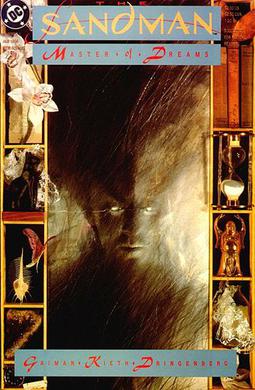
To illustrate the point, let’s start off with a few more mainstream comics. Have a look at this cover for Todd Macfarlane’s Spawn from 1992. It’s still very busy with all that elaborate drapery and chains, but the colour palette is more precise, the colouring more subtle (notice the graduated reds). The art is a lot more stylised though, as this is the period when mainstream comics really start to get a sense of the auteur. By contrast, here’s a cover for a Daredevil collection drawn by Joe Quesada from 1999. It’s very stark and stylish with its simple, bold red, black and white colour scheme and heavily stylised anatomy. These two covers still have a very comic-book-y feel to them, however. Contrast with issue 1 of The Sandman, with art by Dave McKean. With his grungy use of photography and digital painting, McKean’s covers were perfect for the thoughtful dreamscapes of the Sandman, which used more conventional comic styles for its stories. For a glimpse of his work in an actual sequential comics, there are some panels from Batman: Arkham Asylum: A Serious Place on a Serious Earth here and here (from this article). Notice the Dada-like use of collage, the deliberate departure from conventional figurative forms, and the way in which characters (and other objects) change subtly from panel to panel.
The idea that one panel doesn’t have to match the last is popular with more experimental comic artists and writers. It was used as part of the plot in the Sandman series, and was a frequent source of in-jokes in Jamie Hewlett and Alan Martin’s “post-feminist, post-punk, post-apocalyptic, post-box” series Tank Girl, where randomly changing t-shirt slogans and logos became part of the series’ signature style. Stylised, slightly cartoonish artwork is common in alternative comics. Slave Labor Comics, one of my favourite publishers, made its name with titles like Roman Dirge’s Lenore and Johnen Vasquez’s Johnny the Homicidal Maniac (image from this review), comics inspired by and written for members of the goth subculture. Vasquez in particular is a really interesting artist, his stark, geometric style with its heavy inking, unusual angles and sneaky side commentary landed him a short-run cartoon series on Nickelodeon.
These days even mainstream flagship franchises can have unusual art: the last few issues of Uncanny X-Men I picked up featured beautifully lyrical painting instead of Marvel’s usual pen-and-ink. That’s not to say all modern comics are innovative works with gallery-quality art, but artists such as Dave McKean, Jim Lee, Brian Sibley, Roman Dirge, Jamie Hewelett and Drew Rausch are continually changing what comic book art can be with deliberate and frequent departures from the “norm”.
So, getting back to the Pop Art question… why do we think of comic book art as Lichtenstein’s retro style when comic book art has become a wide-ranging, disparate thing? Perhaps simply because the public is more familiar with Lichtenstein than contemporary comics. The Comics Code pushed comic books into a niche market for several decades, and even today in the days of franchises and big budget film adaptations, comparatively few people read comics. Thus, a fine art interpretation of a lowbrow art form has come to define our view of the form, not only because the public think of Lichtenstein’s art as the “norm” for comic art, but also because of the many years comic artists have spent pushing the medium away from that stereotypical image.
PS Comic books are a real collaborative medium and only a handful of titles are created by a single person. Most have separate people providing the script, pencils, inks, colours, lettering and probably editing too. However, because this is an art-sketchbook-blog-thing I've focused here on pencillers with the odd mention of writers or inks.
PS Comic books are a real collaborative medium and only a handful of titles are created by a single person. Most have separate people providing the script, pencils, inks, colours, lettering and probably editing too. However, because this is an art-sketchbook-blog-thing I've focused here on pencillers with the odd mention of writers or inks.
No comments:
Post a Comment