Unfortunately I forgot to bring in my camera so I don’t have progress shots for this one.
Final piece background
I started off with the background, mixing a pale brown and then painting over it with gesso to give it a paler tone and to make it easier to paint over. Then I painted in the background, stating with the sky and the mountains, then adding the foreground, the village and the white details of the snow and the clouds. I painted the foreground in a very thin wash and allowed the paint from the foreground to run to give the background a loose, expressive feel. I took a bit of inspiration from the Dan Bayles paintings I'd looked at in the treatment of the landscape, because I wanted it to have a similarly ethereal feel as his work does. The clouds and the village I painted in much thicker paint so they would stand out and to add to the painterly, expressive effect I wanted to give the background.
The foreground, the portrait itself, proved a lot more difficult. I tried to trace the rough positions of features using an overhead projector but things kept jogging it making it difficult to put things in the right place.
With my first attempt at painting the portrait, I added a layer of black stippled shading to try to capture the shadow in the photograph, but that didn’t seem right. My second attempt turned out like this (after several re-tries with the eyes, nose and lips).
The eyes still need some work and the lips were in the wrong place, but the style of the shading was better, especially around the nose.
With a bit more work it ended up like this. I’m still not entirely happy with the eyes or the mouth but it looks less chubby and the shading looks a lot less harsh. I’m particularly happy with the nearer eye and the light on the earring. For the shading and blending here, I wnet back and looked at some of the artists I'd researched and how they treated blending in skin. I took a lot of inspiration from Guy Denning, not in the colours but in the way he uses his brushstrokes and little flecks of different colours to create a varied tone.
As I say, I'm not completely satisfied with the result, but since I've never tried painting in a realistic style before I'm fairly pleased with bits of it.
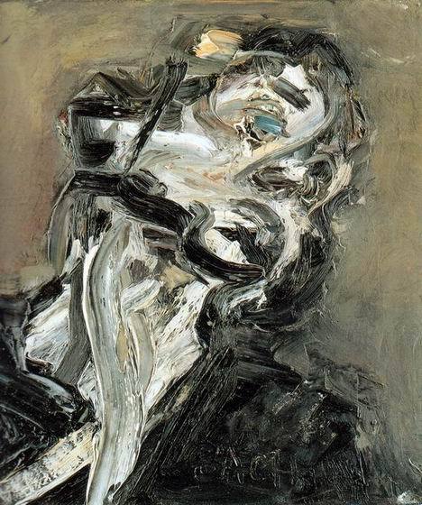
Auerbach is a German-born artist living and working in Britain. His style of painting is fascinating: really thick impasto oils applied and then scraped back. He doesn't use underlayers or sketches, he goes straight into the painting itself. I think that helps add the immediacy his work has. You can't really see in reproductions, but the paint is applied so thickly it almost gives the impression of a relief, with a very tactile quality.
My own photo from Pallant House Gallery in Chichester. I've got to admit, it took me a few moments and a few steps back to realise that this was a portrait (and I felt a bit of a fool) but once I realised, I was amazed by the depth of emotion and character Aurebach could show with just a few strokes.
Larionov was a Russian avante-garde painter who was closely involved in the Russian Neo-Primitive movement which combined cubism with traditional folk art. He was an important figure in the Russian art world, and a founder member of some important groups. There's a definite influence of Van Gogh and Picasso in the bold outlines and bright colours he used, but there's a warmth to his work that I've not seen in Cubism. Perhaps its the colours, but there's something oddly friendly about his work.
Bayles is an American landscape painter. There's something strangely architectural about his paintings. To me they feel like fantasy landscapes, they seem to show impossible places that hang in the air. I really like his use of vertical and horizontal lines, they give his work a graphic feel.
Davis is an American artist who largely paints cartoonish monochrome pieces based on his own memories of childhood and puberty. There's a precision to his paintings that give them the appearance of drawings, but the muted colours lend a sense of memory and longing.
In my last post on portraiture I was focusing rather on ancient and historic portraiture, this time I'm going to look at some contemporary (or at least 20th century and onwards) artists' work.
Lucian Freud
Freud was born in Berlin in 1922, the grandson of the famous neurologist Sigmund Freud and the brother of the late writer and politician Clement Freud. The family moved to England in the 1930s to escape the rise of the Nazi party. Lucian studied at Goldsmith's College UCL and began working as an artist in 1943, when he was comissioned to produce a series of illustrations for a book of poems by Nicholas Moore. His early work tended towards surrealism, with curious juxtapositions of plants and animals, but in the 1950s his style changed into what he is now famous for: expressive but realistic depictions of people, often nudes. In the 1970s he became involved with a group of artists, later called the "School of London", including Francis Bacon who painted several portraits of Freud.
Freud's later work is typified by portraits and nudes. He uses thick impasto and muted colours, and is famous for his penetrating psychological depictions of his sitters, who are frequently family members and close friends. His unusually frank depictions of his sitters had made him a very contraversial figure. Some critics despise him, while newspapers are suspicious of his motives, particularly in the case of his paintings of Sue Tilley, such as Benefits Supervisor Sleeping (below)
Painted in 1995, the painting was sold for a record price in 2008, bringing it huge media attention. It is typical of Freud's style. A varied selection of flesh tones applied heavily gives the impression of uneven skin tone, cellutie and scars. We look down on the couch, giving it a distorted feel, and creating the uncomfortable feeling that the viewer has happened upon the sleeping figure. Her face seems contorted, as though troubled in dreams, but her pose seems comfortable, with her legs tucked beneath her and one arm bracing herself against the couch. Some critics have seen the painting as a cruel attack on obsetity, but I think it's more an attack on society's views on body image; the frankness in the detailing and the intimacy of the pose pull us closer to the model than some would like.
Interestingly, despite attacks on Freud's attitude to the sitter, the sitter herself seems very pleased and very comfortable with the painting as you can see from interviews such as this and this.
Some more examples of Freud's paintings can be seen here.
Francis Bacon
Bacon was born in Dublin in 1909 to English parents, but the family moved to London at the outbreak of the First World War. Prone to allergies and asthma, Bacon recieved very little schooling. While traveling in Europe, he visited an exhibition of Picasso's paintings and decided he would like to become a painter himself. On returning to London, he worked as an interior designer for a while, making sketches and entering competitions (when he tried to submit work for a surrealist show but was told his piece was "insufficiently surreal), before finally capturing public attention with his Three Studies for Figures at the Base of a Crucifixion(1944). He became well known for his disturbing, deformed take on figurative painting and continued to produce challegning works until his death in 1992. For more about his life and his attitudes to his work, here's an excellent edition of the South Bank Show from 1985, with some very interesting interviews with him.
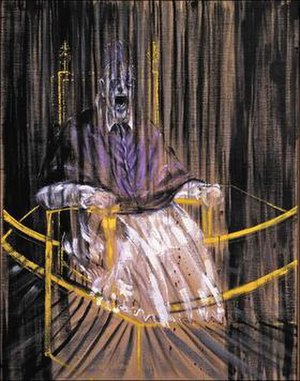
Bacon produced many unusual portraits. He believed that deconstructing a sitter's physical form was the only way to capture their true character. In an age when photography could capture how things appear, Bacon beleived that painting should capture deeper meaning. He also liked to work from pieces from history (if you watch the South Bank Show episode, you'll note he talks a lot about ancient work (such as Egyptian art and Greek plays) and the "masters") as can be seen in his portrait based on the life mask of William Blake and his Study after Velazquez's Portrait of Pope Innocent X:
Bacon produced many different studies for this piece, using largely the same colour pallette (purples, greys, blacks and yellow) and similarly extreme (often screaming) facial expressions (for more on some of these other studies, see Francis Bacon: The Papal Portraits of 1953 published by the Museum of Contemporary Art, San Diego). These studies are often considered portraits in their own right, although they cannot really be said to be portraits of Pope Innocent in the classic sense. These are portraits of a particular emotion, more than the subject of Velazquez's painting. Drawing in elements from photographs of distorted figures, film stills and animal studies, Bacon created paintings that seem immediate, human and yet deformed.
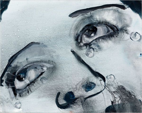
Marlene Dumas was born in South Africa in 1953 and studied Fine Art at the University of Cape Town. She then went on to study at the Psychological Institute of Amsterdam in the Netherlands, where she now lives and works as both an artist and lecturer. Her work, which focuses largely on figures and portraits, has strong psychologial and sexual themes, drawing eroticism and powerful emotions from simple, expressive paintings, as you can see from this selection and analysis from the Saatchi Gallery. She works exclusively from photographs, sometimes including photographs of herself, and often using muted tones and shades of greys, with occassional paintings in brighter tones.
Thematically, she often draws on contraversial subjects. In 1996 she satirised the beauty industry with an installation entitled Miss World Her 2006 installation Man Kind looked at global terrorism and mistaken identity, and she regularly deals with religion, racism and explicit sexuality.
There's a video here in which Marlene talks about her 2009 retrospective Measuring Your Own Grave. She mentions that she achieves some of her interesting colours through simply not cleaning her brushes.
Guy Denning was born in England in 1965, but now lives and works in France. He was a founding member of the Bristol Stuckists group and founded the Neomodern movement in 1997. He frequently uses mixed media in his work, combining stencilled letters with impasto oils, spray paint and cuttings from newspapers and magazines, and he often uses unusually shaped supports created by joining several canvases. The result is work that is expressive and fraught with a sort of vicious physicality. His work is confrontational and highly political.
Nolasco is not a particularly well known painter, but I stumbled across his work while researching this project and I was really struck by it. Nolasco is a Fillipino-American artist, born in New York in 1976 and studied at California State University. He now lives and works in California as both a painter and a location photographer for film, television and print.
His work combines text, wash and line drawing to create bright, engaging portraits and figurative studies.